Unlocking Website Design Secrets with Colour Psychology
Colours have always held a special place in human experiences, they influence our emotions, behaviours, and decision-making processes in ways we often don't consciously realise. This fascinating branch of psychology explores the psychological effects colours have on human perception and interaction. Each colour can evoke different moods, feelings, and reactions, which can vary depending on cultural contexts and individual experiences. Understanding these effects allows us to appreciate why certain colours are chosen in branding, marketing, and design to elicit specific responses from the audience.
Understanding the psychological effects of colours is essential for designers, marketers, and anyone looking to communicate or evoke specific feelings and behaviours. By choosing colours thoughtfully, it's possible to influence perceptions and actions in a desired direction, whether it’s to calm, energise, or inspire.
The influence of colour on taste perception
Did you know that the colour of food can affect how it tastes? Researchers have found that the colour of a drink or food can alter our perception of its flavour. For example, a drink with a more vibrant and appealing colour might be perceived as tastier, even if its flavour remains unchanged. This phenomenon highlights the intricate connection between our visual senses and taste buds.

Colours can affect productivity and creativity
The impact of colours extends beyond aesthetics. Certain colours can boost productivity and creativity. Studies have shown that blue and green environments can enhance focus and creativity, making them ideal choices for workspaces and study areas. Red, on the other hand, can stimulate attention to detail and is often used in tasks requiring precision.
The Impact of colour on temperature perception
Colours can trick our minds into perceiving temperature differences. Warm colours like red, orange, and yellow tend to make us feel warmer, while cool colours such as blue and green can make us feel cooler. This can be harnessed in various design and climate control strategies.
Cultural variations
Cultural variations play a significant role in shaping how humans perceive and attribute meanings to colours. Different cultures have distinct associations and symbolism attached to various colours, leading to diverse interpretations. For example, while red may symbolise love and passion in many Western cultures, it can represent luck and prosperity in Chinese culture. Similarly, white symbolises purity and innocence in the West but signifies mourning and death in parts of Asia. These variations in colour perception reflect the rich tapestry of human traditions, beliefs, and experiences, highlighting the dynamic interplay between culture and our understanding of colours.
Personal preferences
Individual preferences and experiences also play a significant role in how colours affect us. A colour that one person finds calming, another might find depressing. Personal and cultural backgrounds influence these perceptions, making the psychology of colour a complex and nuanced field.
The role of colour in memory and learning:
Colours play a pivotal role in memory and learning processes. Research indicates that information presented in colour is more likely to be remembered than black-and-white information. This finding is particularly significant in educational settings and marketing, where colour is strategically used to enhance retention and recall.
The psychological impact of colour blindness
Colour blindness is more common than one might think, affecting approximately 8% of men and 0.5% of women of Northern European descent. This condition, which impairs the ability to distinguish certain colours, can have significant implications for an individual's perception of the world and everyday tasks. It underscores the importance of inclusive design considerations.
DID YOU KNOW
The colour pink was not recognized as a distinct colour until the 18th century. Before that, it was often classified as a shade of red or purple. The name "pink" itself is believed to have been derived from the flower of the same name, which has a pinkish hue.
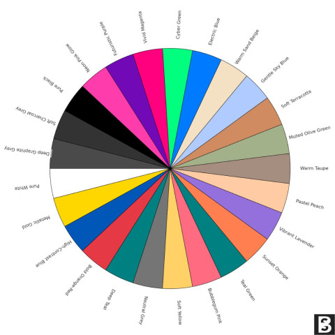
Here’s an overview of common colours and their general psychological impacts:
Red - The colour of Passion and Energy
- Red is known for its ability to stimulate strong emotions, such as love, desire, and passion. It can increase heart rate and evoke a sense of excitement and intensity.
- In marketing, red is often used to grab attention and create a sense of urgency, making it a popular choice for clearance sales and call-to-action buttons.
- It can also signify danger or urgency, which is why it’s often used in warning signs and call-to-action buttons. In branding, red can create a sense of excitement and boldness.
Example business sectors: Advertising, sale signs, stop signals.
Blue - The Calming and Trustworthy Hue
- Blue is associated with calmness, serenity, and trustworthiness. It has a soothing effect on the mind and is often used to promote feelings of security and reliability.
- Many corporate logos, including those of major tech companies like IBM and Facebook, incorporate blue to convey professionalism and dependability.
- Blue is commonly associated with security, tranquillity and can promote mental clarity. Blue is favoured in corporate and tech industries for its professional and reliable connotations.
Example business sectors: Corporate design, social media platforms, healthcare.
Yellow - The colour of Optimism and Cheerfulness
- Yellow, the colour of sunshine, is often seen as a colour of happiness, optimism, and positivity. It can evoke feelings of warmth, energy, and enthusiasm.
- Fast-food chains like McDonald's use yellow to stimulate appetite and create a sense of excitement, while also representing affordability and approachability.
- Yellow, the colour of sunshine, is often associated with happiness, optimism, and energy.
- It can, however, also signal caution.
- It’s used in design to attract attention and evoke a sense of warmth and cheerfulness.
Example business sectors: Warning signs, promotional materials.
Green - The colour of Nature and Balance
- Green is closely associated with nature, growth, and renewal. It symbolises harmony with the environment and can promote a sense of well-being.
- In interior design and healthcare settings, green is often used to create a calming and healing atmosphere.
- It’s linked to balance, growth, and sustainability. This colour is soothing and can foster a sense of peace and harmony.
Example business sectors: Environmental organisations, organic products, wellness brands.
Orange - The colour of vibrancy and energy
- Orange is a colour that often stirs emotions of enthusiasm, excitement, and creativity. It is known to be psychologically stimulating and can evoke a sense of warmth and optimism, making it a colour associated with feelings of joy and vitality.
- Orange combines the energy of red and the happiness of yellow, often associated with creativity, enthusiasm, and warmth. It is attention-grabbing and can be used to signal affordability and value.
Example business sectors: Call-to-action buttons, budget-friendly brands.
Purple - The colour of Luxury and Creativity
- Purple has long been linked to luxury, royalty, and creativity. It can convey a sense of elegance, sophistication, and uniqueness.
- Brands like Cadbury and Yahoo have adopted purple in their logos to stand out and promote creativity.
- It can evoke a sense of mystery, sophistication, and innovation. Lighter shades (like lavender) are considered calming and romantic.
Example business sectors: Luxury products, beauty brands.
Black - The Elegance and Mystery of Darkness
- Black represents elegance, formality, and sophistication. It is often used to create a sense of timelessness and luxury.
- In fashion, black is a popular choice for formal wear, while in technology, it can signify sleekness and modernity.
- Black is associated with power, elegance, and formality. It’s a versatile colour that can convey sophistication or edginess, depending on its use.
- However, it can also represent mourning or evil in certain contexts.
Example business sectors: High-end brands, fashion industry.
White - Evokes feelings of purity, innocence, and simplicity.
- It represents cleanliness and freshness while also symbolising sterility and emptiness in certain contexts, illustrating its capacity to evoke both positive and sterile emotions.
- It can suggest a new beginning or a fresh start.
- In design, white space helps to create a sense of balance and clarity.
Example business sectors :Minimalist design, healthcare, and wellness.
Pink - femininity and relaxation
- While pink is often associated with femininity, it also has a unique psychological effect. Exposure to the colour pink has been found to have a calming and tranquilising influence on individuals.
- Prisons and correctional facilities sometimes use pink-painted walls or even pink prison uniforms to reduce aggression and promote relaxation among inmates.
In conclusion, the psychology of colours is a rich and multifaceted field that continues to reveal intriguing insights into how colours influence our lives. From altering our taste perceptions to affecting productivity and even calming aggressive behaviours, colours wield a profound yet often underestimated power over our psychological and emotional states.

Mailchimp Alternatives Guide 2025
Is Mailchimp still the best FOR EMAIL MARKETING? Or are UK businesses find...
5 min read

The Hidden Cost of Poor System Integration
Why Poor Integration Between Systems Is Holding Your Business Back And How...
8 min read

Admin Overload: The Silent Business Killer
The cost of manual, repetitive admin tasks In countless small and medium-s...
3 min read


