2026 Colours trends for website design
2026 Colour Trends for Website Design
Digital spaces are undergoing a profound aesthetic shift, after years of sensory overload and aggressive, conversion driven interfaces, user interface design is entering an era of emotional utility. 2026 colour trends for website design are no longer about simply picking attractive palettes, instead, it focuses on building adaptive, accessible colour systems that respect user attention while injecting strategic bursts of personality.
This comprehensive guide explores the defining website design colour trends for 2026, providing actionable insights for frontend developers, UI specialists and brand strategists looking to build high impact, search optimised websites.
The Cultural Drivers Behind the 2026 Shift
The internet has become increasingly crowded and users are pushing back against digital fatigue, consequently, corporate tech website design is moving away from clinical, blindingly white screens and uniform corporate blues.
The widespread adoption of high contrast OLED displays has altered how screens render light, making dark mode optimisation a standard expectation rather than an afterthought, simultaneously, the rise of artificial intelligence generated imagery has triggered a dual reaction. While some web platforms embrace hyperreal, computational gradients, others are retreating into tactile, organic hues that feel distinctly human.
Accessibility regulations have also tightened globally. Colour contrast ratios, focus state indicators and multi modal visual cues are now foundational elements of any design system. The overarching 2026 colour trends for website design is balance: establishing a calm, high performance foundation and contrasting it with intentional, emotionally resonant accents.
Trend 1: The New UX Foundations and Restorative Neutrals
The era of stark, blinding white backgrounds is drawing to a close. To combat visual fatigue and reduce screen glare, websites are turning to softer, more sophisticated foundations that feel gentle on the eyes.
1. Cloud Dancer and Ethereal Whites
- HEX Code: #F0F0EB
- Colour: A soft, creamy off white with a tiny hint of warmth.
Pantone has set the tone for 2026 website design colour trends with its key shade, Cloud Dancer. This is a soft, airy and slightly warm white that acts as a soothing alternative to traditional pure white. When used as a primary background colour, it provides exceptional visual breathing room, allowing typography and product photography to stand out effortlessly without straining the eyes.
Potential Sectors
- Legal and financial consultancies looking to build trust without looking outdated
- Minimalist fashion houses and premium lifestyle boutiques
- Architecture practices and high end interior design studios
- Independent publishing houses and digital journalism platforms
2. Mocha Mousse and Earthy Minimalism
- HEX Code: #A47864
- Colour: A warm, comforting milk chocolate brown.
At the deeper end of the neutral spectrum sits Mocha Mousse, a rich, warming brown that introduces quiet sophistication to minimalist layouts. This tone is particularly effective for lifestyle brands, sustainable ecommerce platforms and content heavy publishers. It pairs beautifully with charcoal typography, evoking a sense of stability, trust and physical texture that purely digital hues often lack.
Potential Sectors
- Heritage luxury retail and artisan goods
- Organic food suppliers, coffee roasters and culinary blogs
- Ethical property developments and sustainable estate agencies
- Premium leather goods and slow fashion marketplaces
DID YOU KNOW
Colours can influence memory retention. Information presented in colour is more likely to be remembered than information presented in black and white.
Trend 2: Mood Mode and Advanced Dark Themes
Dark mode has evolved far beyond a simple colour inversion toggle. In 2026, website and Bespoke designers treat dark mode as a distinct editorial experience, often referred to as Mood Mode.
Instead of generic pitch black backdrops, contemporary interfaces utilise multi layered, dark palettes built from deep charcoals, midnight plums and rich forest inks, these backgrounds are meticulously tokenised to ensure text remains crisp and readable over prolonged browsing sessions.
The true magic of Mood Mode lies in how it interacts with light. Software as a Service (SaaS) dashboards and creative portfolios are utilising subtle neon micro accents, such as electric cyan, laser pink or lime green, to highlight critical call to action buttons and key metrics, this high contrast approach feels ultra modern and energetic without overwhelming the user.
Potential Sectors
- Financial technology platforms and cryptocurrency exchanges
- Developer tools, data analytics dashboards and cloud computing interfaces
- Digital art portfolios and cinematic production agencies
- Premium night time entertainment and ticketing platforms
Trend 3: Dopamine Hues and Expressive Accents
While restorative neutrals handle the structural layout, vibrant, high energy shades are being utilised to inject optimism and direct user attention.
1. Tangerine Disco and Persimmon
- HEX Code: #E65C00
- Colour: A bright, bold, juicy orange.
Rich, sun kissed oranges that sit comfortably between retro warmth and glossy digital brightness are dominating hero sections. Tangerine Disco and Persimmon bring instant theatrical impact. These shades evoke nostalgia for the late seventies and early eighties whilst retaining a clean, vector finish. They are highly effective for promotional banners, primary buttons and interactions that require a burst of positive energy.
Potential Sectors
- Creative marketing agencies and indie advertising firms
- Fast casual food delivery applications and beverage start-ups
- Event organisers, music festivals and community hubs
- Gen Z targeted ecommerce brands and independent streetwear labels
2. Digital Lavender and Soft Pastels
- HEX Code: #E1D5E7
- Colour: A pale, calming, chalky purple.
For tech and wellness platforms seeking an optimistic tone without intense saturation, Digital Lavender remains a firm favourite. This understated purple offers tranquillity and mental clarity. When combined with chalky mint greens or pale terracotta's, it forms a balanced, friendly aesthetic that appeals to audiences looking for a gentler online experience.
Potential Sectors
- Mental health platforms, meditation apps and therapy networks
- Modern HR tech tools and employee wellness spaces
- Skincare brands and holistic beauty ecommerce
- EdTech systems focusing on stress free digital learning
Trend 4: Eco Digital and Transformative Greens
Sustainability and climate awareness continue to reshape corporate branding, leading to the rise of the eco digital palette. This 2026 website colour design trend updates traditional, rustic organic greens into a slicker, tech forward ecosystem.
Transformative Teal
- HEX Code: #005F73
- Colour: A deep, rich blue green.
Transformative Teal is the standout shade here, perfectly bridging the gap between natural aquatic environments and computational design. Alongside smoky jade, moss and warm eucalyptus, these tones are heavily utilised by green tech companies, outdoor brands and wellness applications. They symbolise adaptation and renewal, pairing exceptionally well with raw textures, paper grain overlays and elegant serif typography.
Potential Sectors
- Renewable energy providers and climate tech start-ups
- Outdoor gear retailers and adventure travel companies
- Scientific research institutes and conservation charities
- Modern wellness retreats and organic agriculture platforms
DID YOU KNOW
Psychological research shows that people make a subconscious judgment about a product or website within 90 seconds of their first viewing and up to 90% of that initial assessment is based entirely on the colour palette.
Trend 5: AI Iridescence and Hyperreal Gradients
The influence of generative art has birthed a highly distinctive, futuristic colour scheme characterised by fluid, metallic and translucent finishes.
Unlike the flat, linear rainbow gradients of the past decade, the 2026 gradient is ambient, smoky and deeply layered. Web and Bespoke Designers are using blurred glow fields, mesh gradients and subtle, interactive background animations to mimic the play of light on water, a style often called Mermaidcore.
Featuring palettes of Holo Lilac, Plasma Teal and Pearlescent Silver against deep voids, this aesthetic is highly popular among innovation hubs, web3 projects and high end creative agencies looking to demonstrate cutting edge digital capability.
Potential Sectors
- Artificial intelligence research hubs and automation tools
- Immersive Web3, virtual reality and gaming web applications
- Futuristic hardware companies and next generation consumer tech
- Experiential digital agencies and 3D design studios
Colour Matrix and Performance Palettes
To help apply these 2026 colour trends for website design practically, the table below outlines the core colour relationships for 2026, complete with HEX values and straightforward descriptions.
| Trend Aesthetic | Primary Base | Secondary Neutral | Hero Accent | Ideal Industry Application | Simple English Style |
| Restorative Minimalist | Cloud Dancer (#F0F0EB) | Warm Paper (#EAE5D9) | Slate UI (#2F3E46) | Professional Services, B2B SaaS | Off white and soft cream with dark grey details |
| Mood Mode | True Charcoal (#1C1A27) | Deep Surface (#2D2A3A) | Electric Cyan (#00F5D4) | Dashboards, Financial Tech, Portfolios | Very dark grey with glowing neon blue highlights |
| Retro Revival | Mocha Mousse (#A47864) | Rich Cream (#FFF3E3) | Tangerine Disco (#E65C00) | Hospitality, Premium Retail | Warm chocolate brown and smooth cream with bright orange accents |
| Eco Digital | Deep Ink (#0A192F) | Sand (#E0D6C8) | Transformative Teal (#005F73) | Climate Tech, Modern Wellness | Dark midnight base with soft tan and deep blue green accents |
| Hyperreal Tech | Void Black (#050505) | Quartz (#D8B4F8) | Plasma Teal (#00F0FF) | AI Start-ups, Interactive Agencies | Jet black background with pale purple and bright neon teal highlights |
Optimising Your Colour Strategy for Search and Usability
From a search engine optimisation (SEO) perspective, website aesthetics directly influence user engagement metrics, which impacts search visibility. Poorly balanced colour schemes increase bounce rates, while intuitive, accessible palettes encourage users to stay longer, browse deeper and convert.
Prioritise Contrast and Readability
Ensure your text and background combinations comply strictly with accessibility guidelines. High contrast guarantees that search engine bots crawling your site structure and human users navigating your content can read every piece of information effortlessly across all mobile and desktop devices.
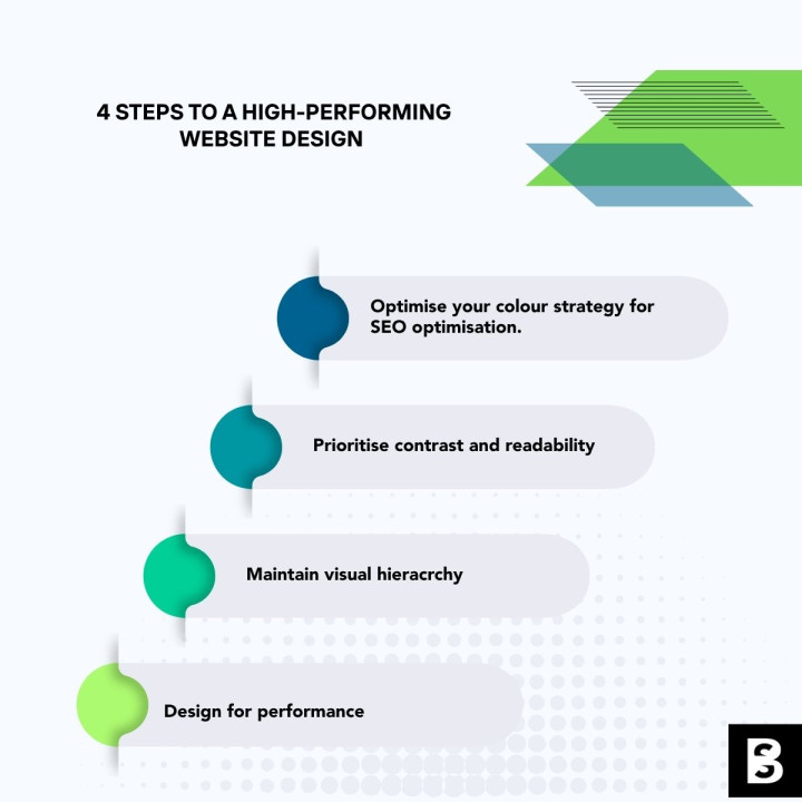
Maintain Visual Hierarchy
Reserve your high saturation dopamine pops*, such as Wasabi green or Persimmon red, exclusively for conversion elements. If your background, headers and buttons are all competing for visual dominance, the user cognitive load increases, leading to drop offs. Let your neutral foundations do the heavy lifting, allowing your accent colours to signal the exact path to purchase.
*Dopamine pops of colour refer to the psychology of using vibrant, eye-catching hues to trigger the brain's reward system and boost your mood.
Design for Performance
Complex, multi layered mesh gradients can hinder site performance if implemented incorrectly. Use modern web development techniques like CSS custom properties, canvas rendering or optimised vector formats to ensure your beautiful colour designs do not compromise page load speeds, which is a critical ranking factor.
By adopting these adaptive colour principles, your web platform will remain visually compelling, accessible and perfectly aligned with the evolving expectations of the modern internet.
Ready to elevate your digital presence? Contact us today to seamlessly integrate the 2026 colour trends website design into an accessible, high-converting design system tailored for your brand.

Google analytics dropping?
1. Google Analytics The old version of Google Analytics (known as Universa...
5 min read

Stop business subscriptions with Bespoke software
Subscription Creep: hidden system costs Many business owners genuinely bel...
7 min read

Workflow Optimisation - Emerging Trends 2026
Bespoke Software in Workflow Optimisation Bespoke software, specifically d...
7 min read

The definitive guide to MVP development 2026
The definitive guide to MVP development 2026 A Step-by-Step Guide for Star...
4 min read

Business Plans - Comprehensive Guide Part 6
A comprehensive Business Plan should include essential financial and strate...
13 min read
Stop business subscriptions with Bespoke software
Subscription Creep: hidden system costs Many business owners genuinely bel...
7 min read